Fewer Phone Calls, More Capitol Visits: A Website That Delivers
Case Study
Washington State Capitol Campus


The Problem
The Washington State Capitol Campus website was hard to navigate and frustrated visitors. Each year, thousands of people—from school field trip organizers to tourists—visit to explore its historic buildings, monuments, and parks. Yet, the site failed to provide clear information on basics like tour times, parking, and directions.
This led to many phone calls to the Washington State Department of Enterprise Services, pulling staff away from their work.
The Department of Enterprise Services needed a smarter, simpler way to help people plan their trips and get excited to visit the Capitol Campus.
The Solution
This project went beyond simply creating a better website—it involved a complete reimagining of the Capitol Campus's online presence. This required a deep understanding of what visitors, and the Department of Enterprise Services staff needed.
Our process began with listening to users through focus groups, interviews, and usability research. The feedback showed challenges like unintuitive navigation, hard-to-find information, and a need for a more resourceful, user-friendly “guide” to help visitors prepare. The data was clear—users wanted simplicity, visibility, and a personal touch.

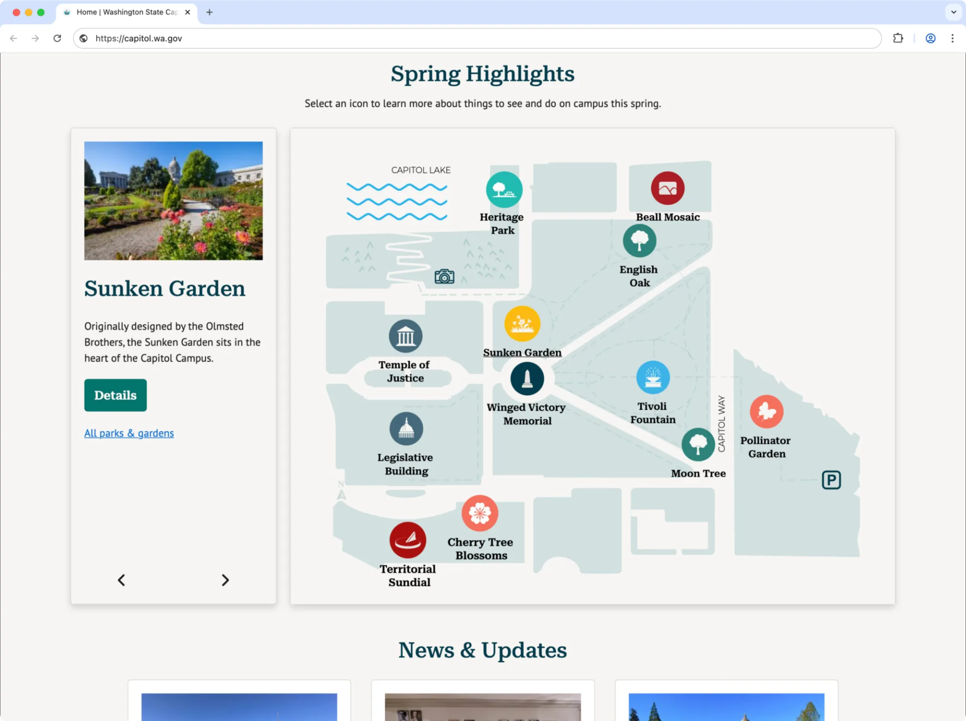
Using research insights, we developed an intuitive interface with features like a detailed campus map, a “Know Before You Go” section with tips, and frequently asked questions for self-service.
Working with WaTech, we used these insights to design an intuitive interface with features like a detailed campus map, a “Know Before You Go” section with tips, and frequently asked questions for self-service.
We also refreshed the brand with a modern logo and color palette. Feedback from focus groups ensured the brand appealed to people, building a meaningful connection between the campus and its visitors. This update created a welcoming new appearance that invites a diverse audience.

We refreshed the brand with a modern logo and color palette based on feedback from focus groups.
The Impact
This project proves what’s possible when great design meets government services. It fosters greater engagement, reduces frustration, and puts users where they belong—at the center of the experience. A pre-launch usability study proved that 78% of users successfully completed their tasks on the website, and the site earned an impressive System Usability Score (SUS) of 84 out of 100. These results confirm the website delivers clear, reliable information exactly when people need it.
For the Department of Enterprise Services’ staff, the benefits are just as significant. The website’s self-service capabilities reduced calls, letting staff focus on their jobs. Beyond solving immediate challenges, the Capitol Campus website is a model for harnessing design and technology to serve teams and communities more effectively.
Awards and Accolades
w3 Awards
- Silver – Website Features: Best Visual Appeal – Utility, Best User Experience
- Silver – General Websites: Tourism, Cultural Institutions, Government – State, Municipal Organizations, Website Redesign
Muse Awards
- Gold – Website: Government
- Silver – Website: Tourism, Best User Experience, Website Redesign, Public Service Experience Design
- Silver – Branded Content: Government
Davey Awards
- Gold – General: Tourism
- Silver – Website Features: Best User Interface, Website Redesign

